Screenshot: Supporting agents with easier route planning through calendar design to simplify the task delivery processProject Two : Creating User Centered Calendar for Efficient Agent Workflows
Simplifying Scheduling: Designing a Task Driven Calendar for Agents Portal
Duration
8 Sprints (2 Weeks x 4)
Role
Product Designer
Industry
1 x Product Designer (me) 1 x Project Manager 1 x Business Analyst
Context
I was assigned to improve a core feature of the Doorknock app: the calendar view used by real estate agents to schedule, manage delivery tasks, and organize routes within a 15 day timeframe.
The existing calendar had limited functionality and poor usability, making task planning inefficient and frustrating for users.
This case study demonstrates how I redesigned the calendar experience to deliver a more intuitive, streamlined, and user-centered design focusing on task creation, clarity, and aligning with real-world workflows to improve efficiency, engagement, and adoption.
Redesigning Delivery Scheduling: An Agile Approach to a Workflow-Centered Calendar
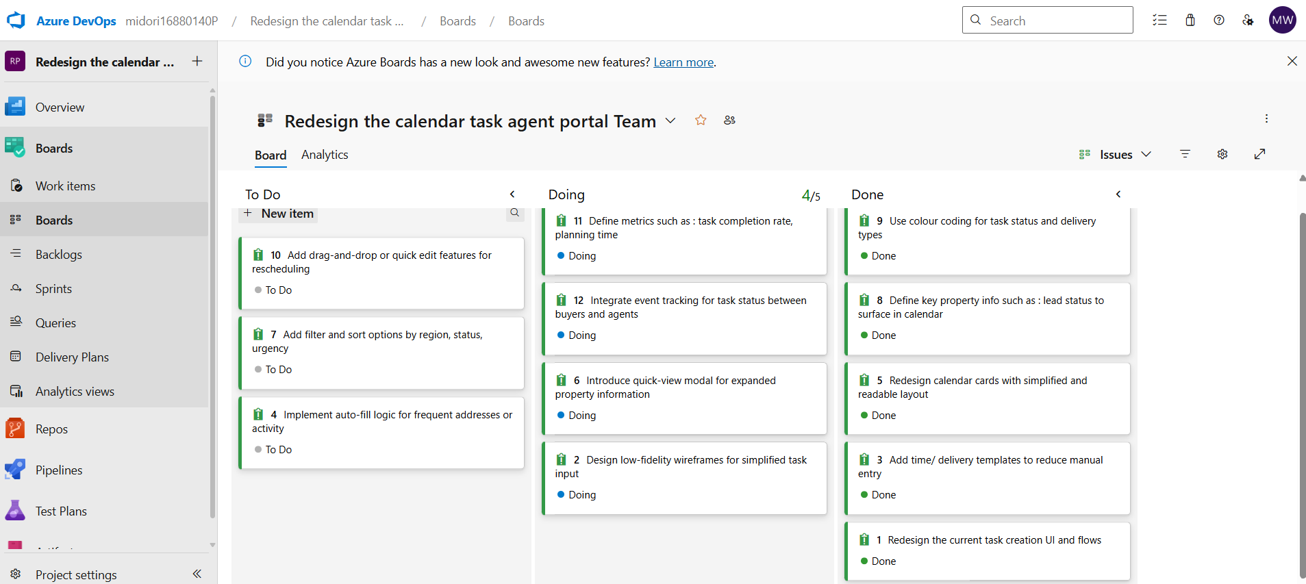
I applied agile sprint planning in Azure DevOps to manage tasks, ensure progress, and guide the team in building a calendar aligned with agent workflows.
Problem Diagnosed
Users reported that the task creation flow was confusing, the interface felt cluttered, and critical information, such as property details and scheduling status was difficult to interpret.
These usability gaps resulted in inefficient planning, missed delivery deadlines, and increased frustration for agents trying to manage their daily workflows.
1.Problem Discover & Learn about user
Through user interviews and competitor analysis, I identified key challenges agents faced when using the app. By closely observing their day to day routines and listening to their frustrations and expectations, I developed a deeper understanding of their interactions with the platform. This process revealed not just what issues existed, but why they were happening—enabling more user-centered and impactful design decisions.

sscreenshots of the user testing sessions conducted on the existing MVP design
Guided by user feedback, I explored how competitors approach similar tools. Agents shared that they were looking for something different—an experience that truly supports their unique Doorknock workflows, not just another version of what they’ve already seen.
Real estate agents using the Doorknock app struggled to plan and manage delivery tasks effectively. The task creation flow was confusing, the calendar interface felt cluttered, and property scheduling was often unclear.
These usability issues created barriers to organization, led to delays and inefficiencies, and caused frustration in agents’ day to day workflows, directly impacting productivity and user adoption.
Problem Statement
Based on the problem statement, I developed the hypothesis that a targeted calendar procession:
Hypothesis: If we simplify the task creation process and enhance the clarity of property information within the calendar view, agents will be able to plan and manage deliveries more efficiently and with greater confidence—leading to higher task completion rates and stronger user satisfaction.
Success Measures
Increase in Task Completion Rate: Agents are able to create and finish more delivery tasks using the calendar task scheduling.
Faster Planning: It takes agents less time to schedule and organise their Doorknock deliveries.
Decrease in Missed or Delayed Deliveries: Fewer late or forgotten tasks thanks to a clearer planning flow.

Defining the Solution Through User Stories
Grounded in the problem statement and validated through user research, I developed user stories that shaped a clear, user focused design approach. The goal was to enable real estate agents to plan, schedule, and manage Doorknock deliveries with less effort, improved efficiency, and greater confidence.
Research findings confirmed the need for a streamlined digital experience—an app that directly supports the core daily tasks agents rely on. Below are the key jobs to be done that guided the redesign:
Display total potential leads awaiting Doorknock tag delivery.
Allow agents to assign tasks to specific leads or geographic areas.
Provide real-time updates on lead status with a clear summary of delivered tags.
Enable progress tracking to ensure deadlines are met and workflows stay on schedule.
To guide the design process, I developed a user story that outlines key requirements from the user’s perspective, which is critical in Agile for aligning features with real user needs:
As an agent, who wants to use the app to create a work task,
I want a simple and clear way to create Doorknock Tag deliver tasks and view property information within the calendar,
So that I can efficiently plan and manage my deliveries achieve the result.
2 . Ideation to the brainstorm solution
Organizing User Insights with Affinity Mapping to Improve Task Creation and Calendar Usability :
helped identify common challenges agents face in task creation, delivery scheduling, and updating property status. By clustering related issues and needs, I was able to prioritize simplifying the task creation process and enhancing the usability of the calendar view.

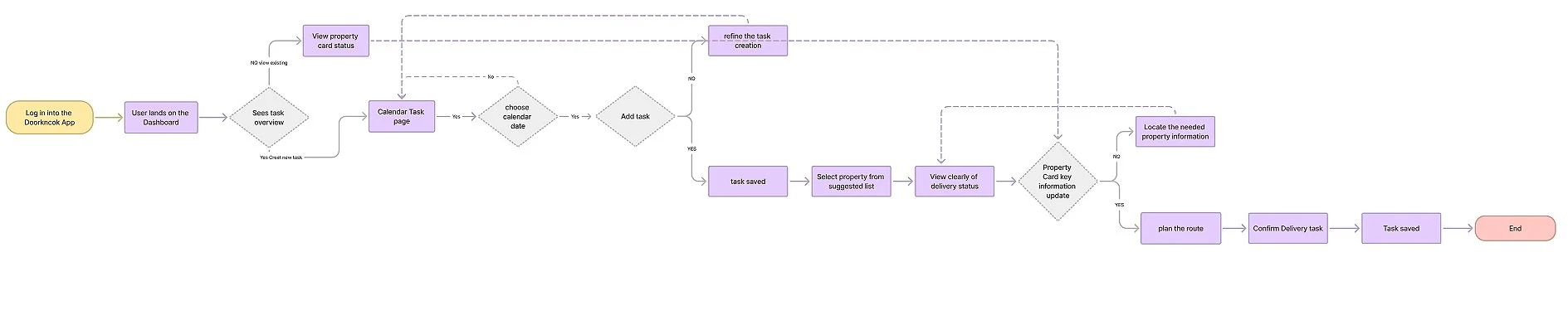
Structuring User Journeys with Flow Mapping Insights :
I used flow mapping to break down and visualize each step agents take when completing their tasks. This helped me see how they move through the system, where they get stuck, and which parts take too long or feel confusing. By understanding the full journey, I could spot areas that needed improvement and design a simpler, more user-friendly experience to better support agents in their daily work.
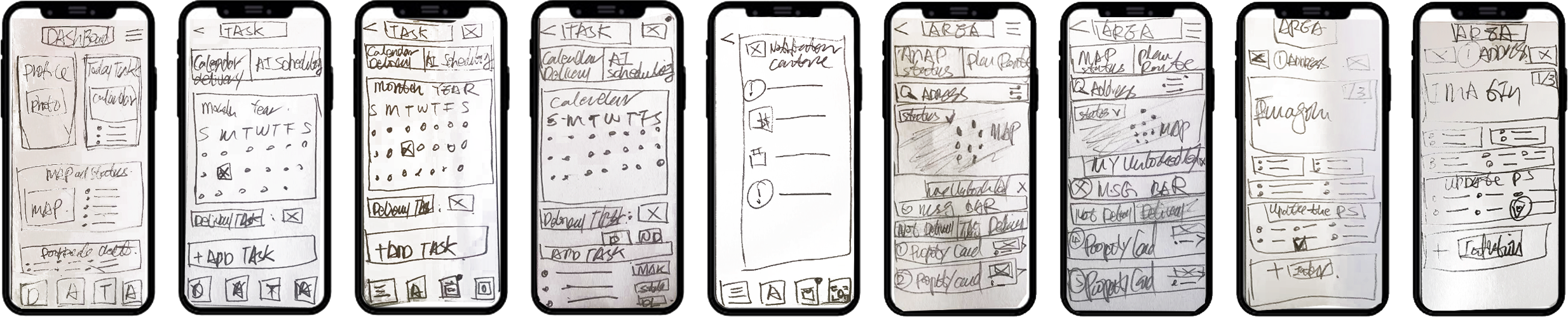
3 . From skeching to lo-fi prototype
Used sketching to conceptualize how the calendar-based task delivery planning should function to meet the specific needs of real estate agents.
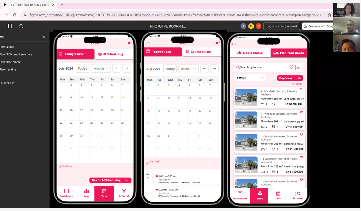
Starting with wireframes, I mapped out the calendar experience to help agents plan deliveries with ease. These early visuals laid the groundwork for a more intuitive structure. I then created an interactive prototype and tested it with six participants to gather meaningful feedback and guide improvements.
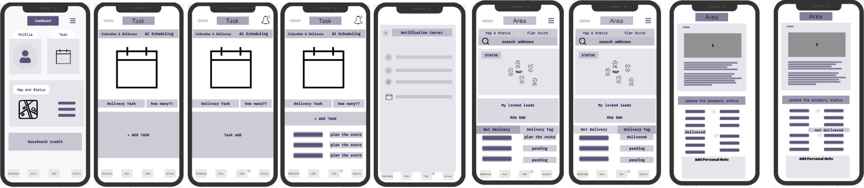
Before running user testing, I took a step back to redesign the app’s interface by removing usability barriers, enhancing visual clarity, and streamlining navigation flows.
By fixing these foundational issues first, I created the conditions for testers to provide meaningful feedback on the core features that matter most to user adoption and engagement.
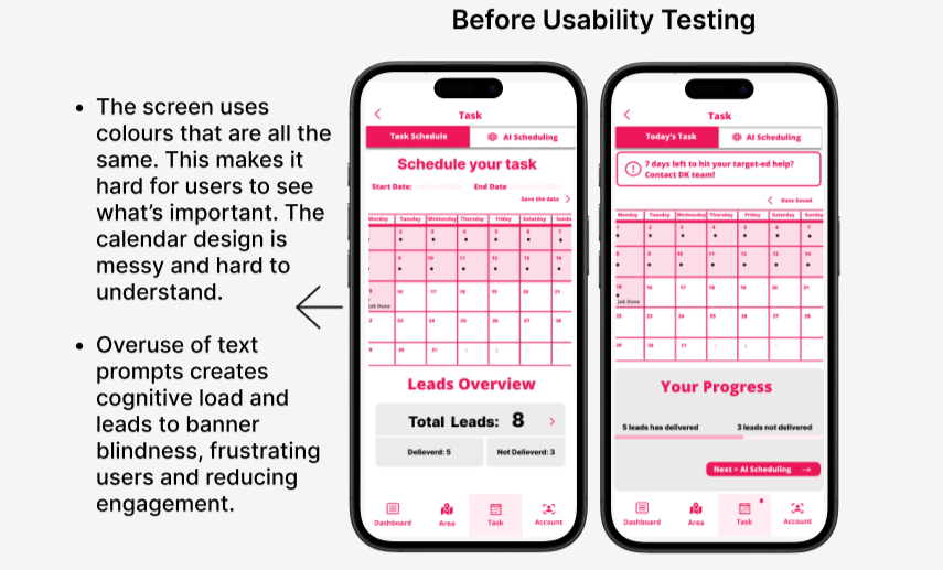
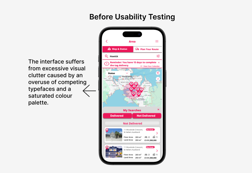
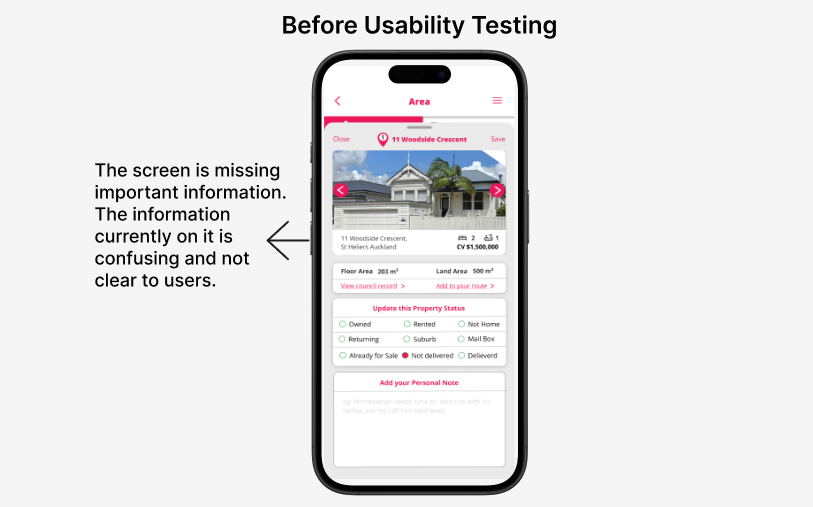
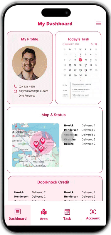
Original design
The layout felt cluttered, making it hard to understand how the calendar could actually support daily workflow , which lacked clear usability and failed to highlight the core function of task management.
During testing, users voiced that the dashboard felt more like a billing tool than a productivity assistant, which its heavy foucs on charging leads sent the wrong message.

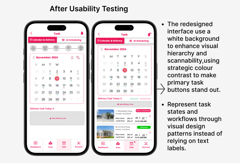
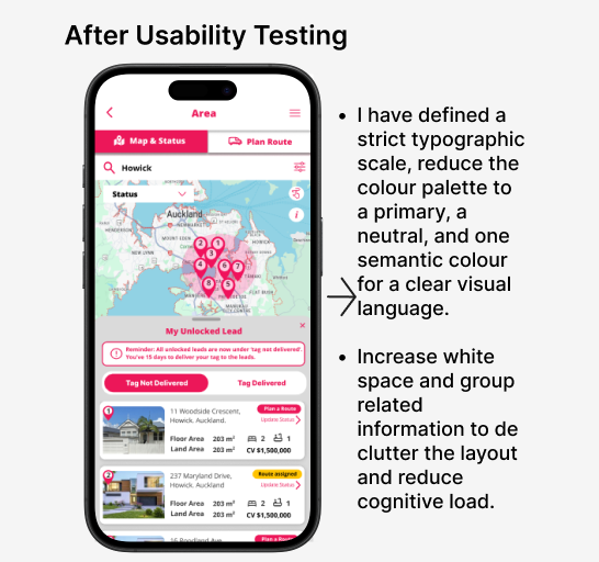
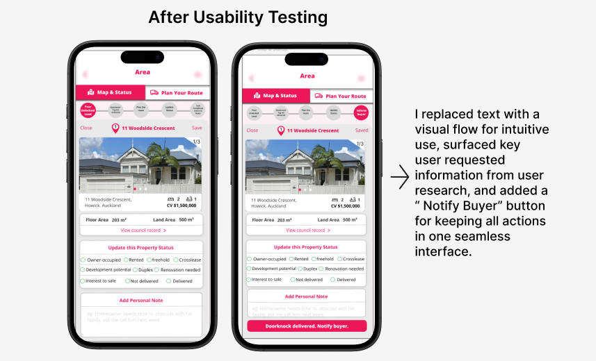
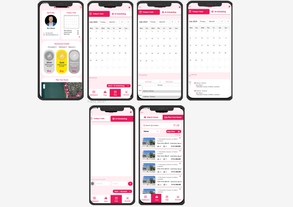
Redesign
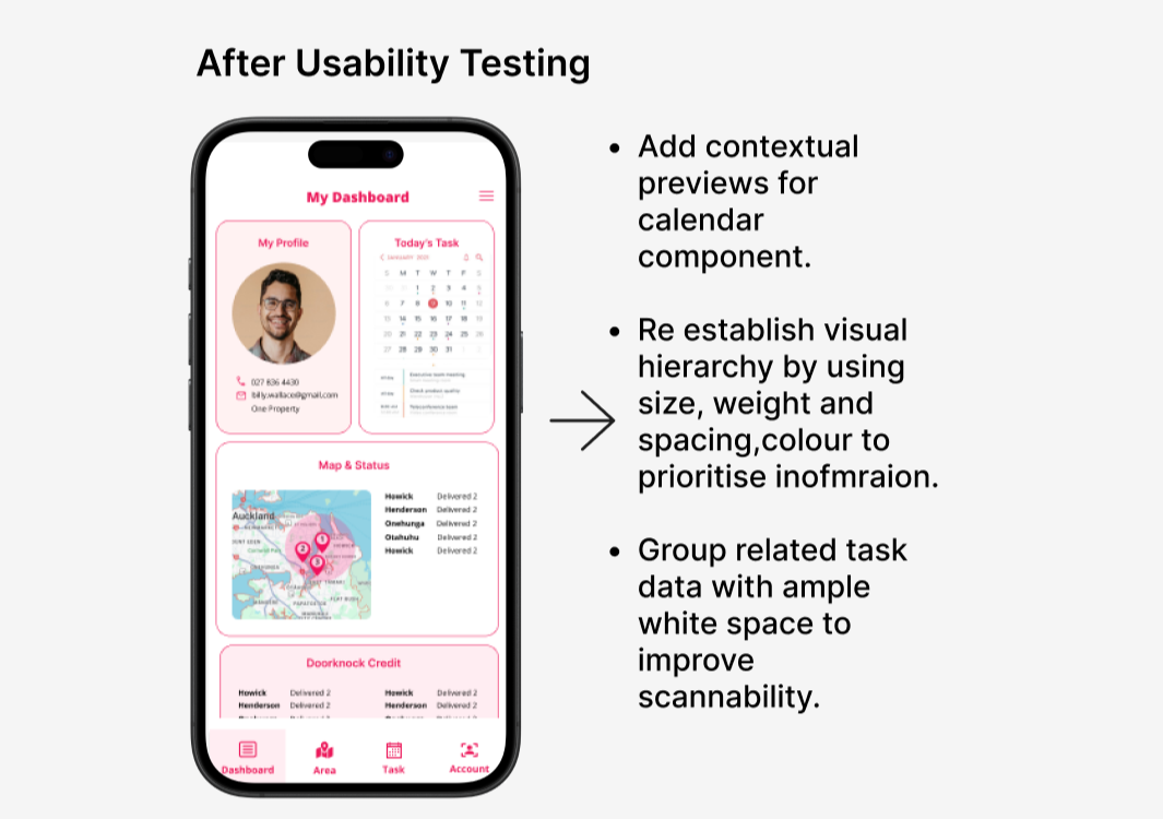
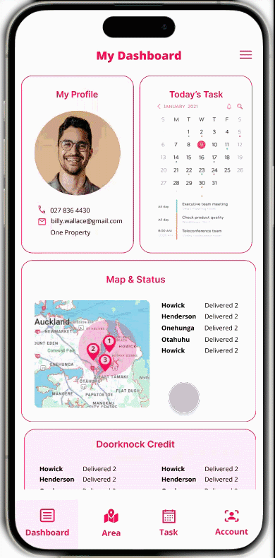
Calendar task interface was redesigned to put usability first. The clutter was removed, and the layout was simplified to mirror the intuitive flow users expected from everyday calendar tools.
Core functions like scheduling, task tracking, and route planning were brought to the forefront, making it clear how the calendar could help agents manage day efficiently.
The dashboard was also reimagined to shift focus away from lead charges and toward user goals by highlighting actionable tasks and upcoming priorities.
4. User Testing
After redesigning the app, I ran remote usability test to evaluate its ease of use and alignment with our design goals.
By analyzing feedback and pinpointing issues, I made updates that improved user satisfaction, addressed core challenges, and boosted engagement.
The prototype shown here represents the MVP version tested with users.Usability Testing Plan : Assessing the Agent Experience in Planning Doorknock Tasks via Calendar View
🔍 What to Test:
To test whether the redesigned task creation flow and calendar interface improve usability.
To observe how real estate agents interact with the new design and identify usability pain points.
To test the ease of interpreting property cards within the calendar view.
Measure whether users can complete the planning process with minimal friction
🎯 Objective:
The key finding from the user testing are below:
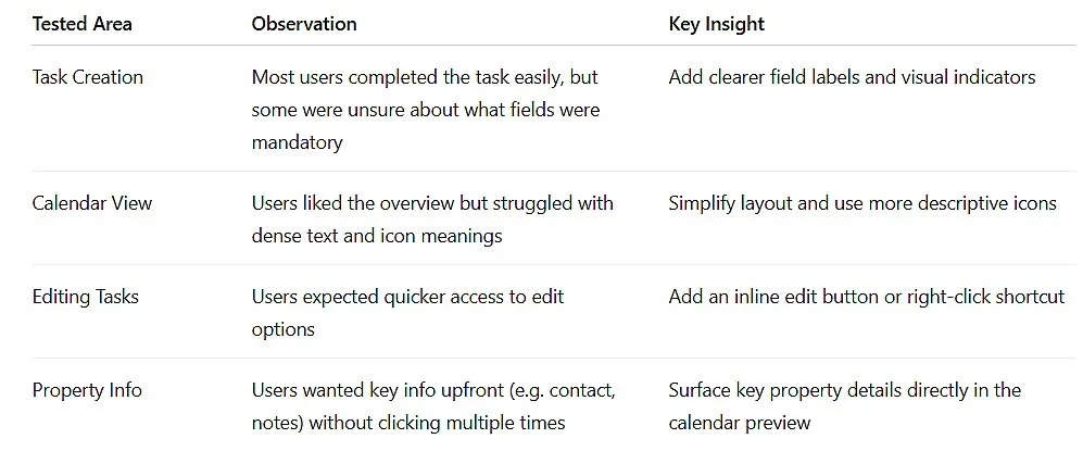
Recommendations
The calendar should be able to sync to the cellphone calendar
User able to use the route planning be automatically assigned within the app, rather than requiring manual input.
User prefers to receive a reminder via text message, rather than having to check the message in the app.
User prefers to be provide brief explanations for unclear icons or actions to boost confidence.