Project 3 . Enhancing Usability in Doorknock’s Credit Management Portal
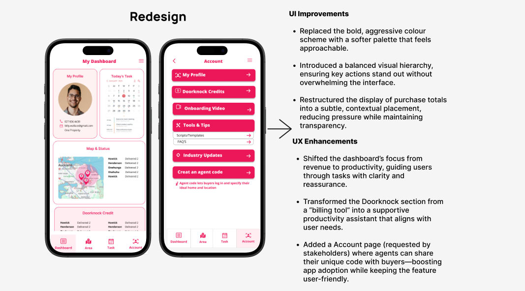
Redesigned the credit summary interface to improve clarity around purchasing, topping up, and unlocking leads.
Role
Product Designer
Industry
1 x Product Designer (me) 1 x Project Manager 1 x Business Analyst
Duration
4 Sprints (2 Weeks x 2)
Context
Agents rely on DK credits to unlock vital property leads, making them a core part of daily operations. Feedback showed the credit summary screen was confusing, leaving users uncertain about balances, usage, and top ups.
By leading the second design sprint with an Agile approach, I redesigned the interface to be intuitive and easy to navigate, enabling agents to track and manage credits with confidence turning a pain point into a frictionless experience..
Using Agile to Simplify Credit Management in Doorknock’s Agent Portal:
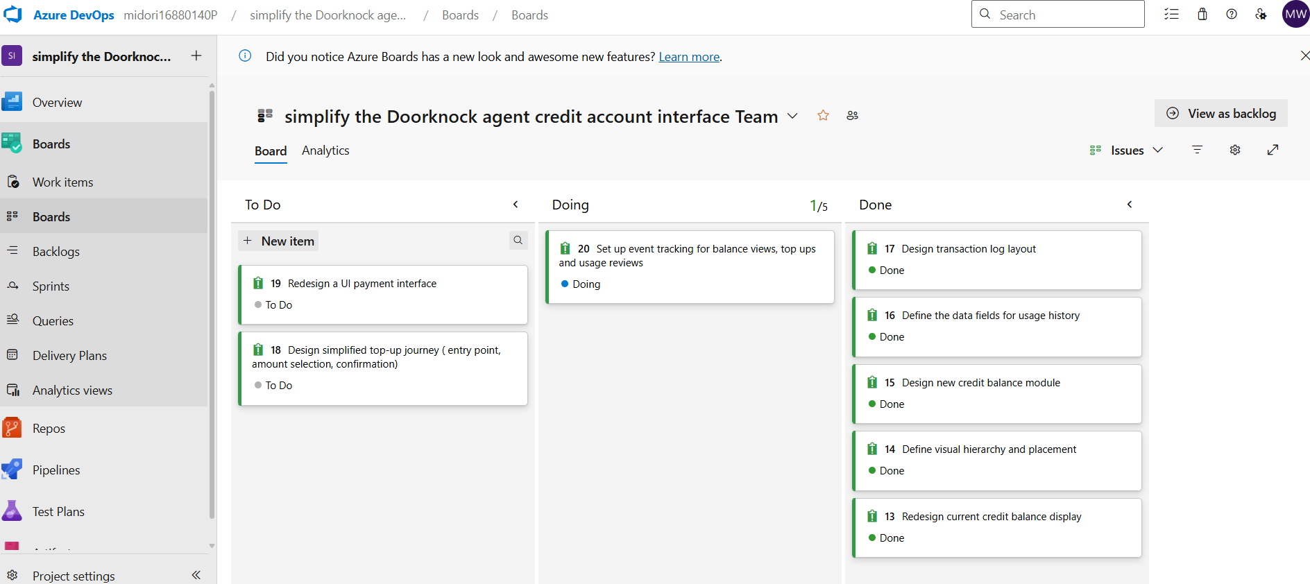
Using Azure DevOps and agile sprint planning, I organised tasks, tracked progress, and collaborated with the team to deliver a simplified interface that helps agents easily understand their credit balance, top-up history, and usage summary.
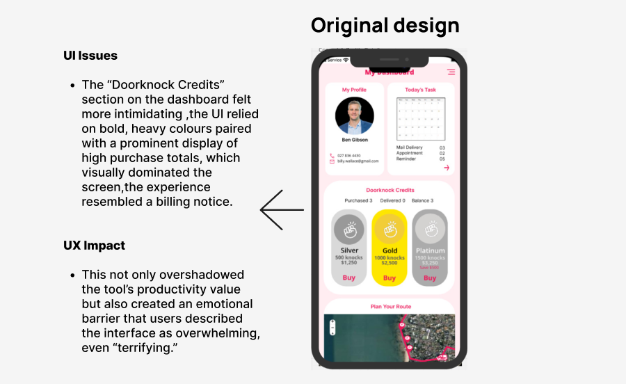
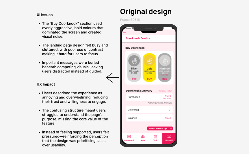
Problem Diagnosed
The credit summary UI created user confusion due to poor visibility of balances, recent usage, and top-up processes, resulting in workflow friction and inefficiencies that slowed agents from unlocking leads and driving business results.
Through user interviews and observation, I discovered that agents often hesitated or delayed using credits due to lack of transparency in the UI. Some misinterpreted the balance, while others were unsure how or when to top up. This directly impacted engagement and user confidence in the platform.
Problem Discover & Learn About User
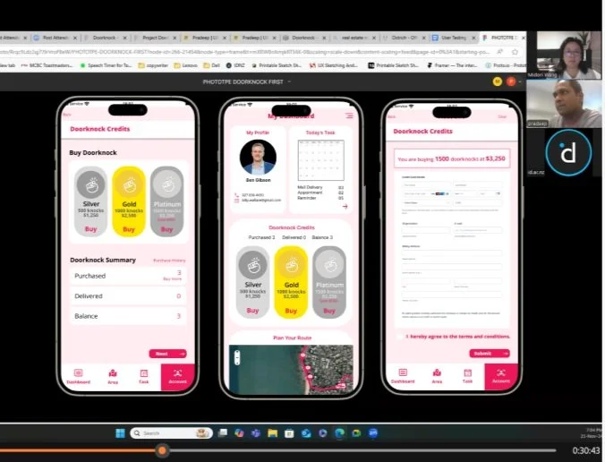
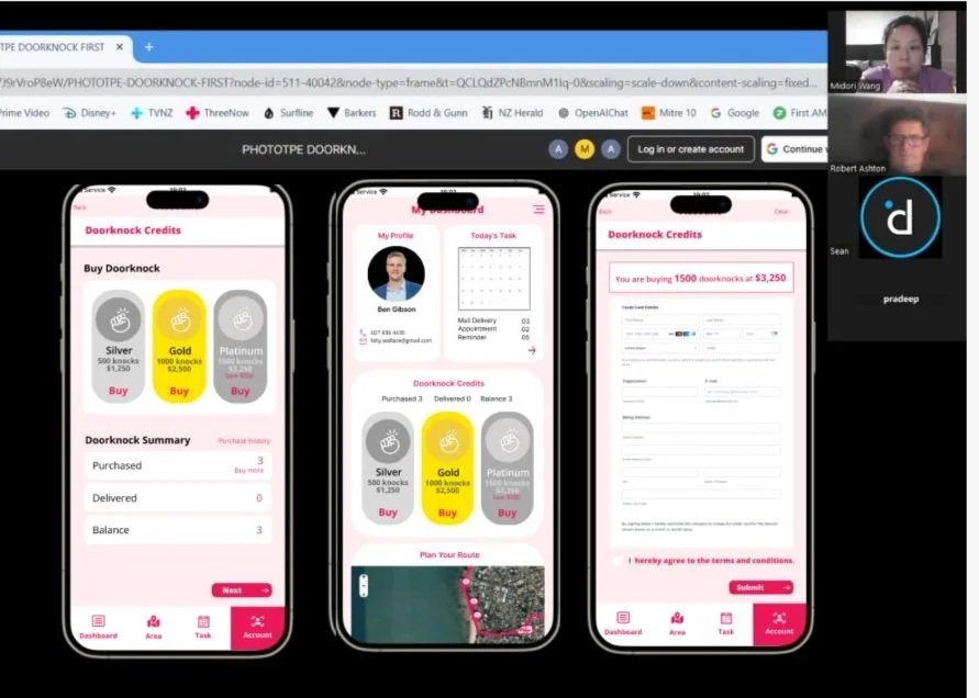
Screenshots from user interview sessions conducted using the existing MVP design.Problem Statement
The existing DK credit interface leaves agents uncertain about their credit balance, usage patterns, and top-up options. This friction erodes confidence and makes it harder for them to stay consistently engaged with property leads.
Hypothesis: If we redesign the DK credit summary UI to clearly communicate balance, usage history, and top-up actions, agents will feel more confident in managing credits and be more likely to engage with property leads consistently.
Increased Usability Confidence: Agents feel more confident managing their credits, as they can easily view their balance, understand usage history, and complete top-ups without confusion.
Faster Credit Task Completion: Agents are able to complete credit-related actions—such as checking balances or topping up—more quickly, showing the interface is more intuitive and efficient.
Success Measures:

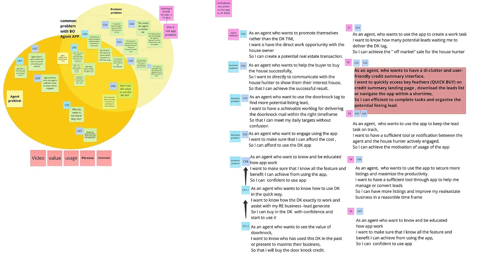
Defining the Solution Through User Stories
Based on the problem statement and insights from user research, I created user stories to guide a user-focused design approach. The goal was to improve the agent experience within Doorknock’s credit system—making it easier to purchase credits, top up, and review lead usage. Research confirmed the need for a streamlined digital experience that supports the key tasks agents perform daily. Below are the core jobs the design was built to support:
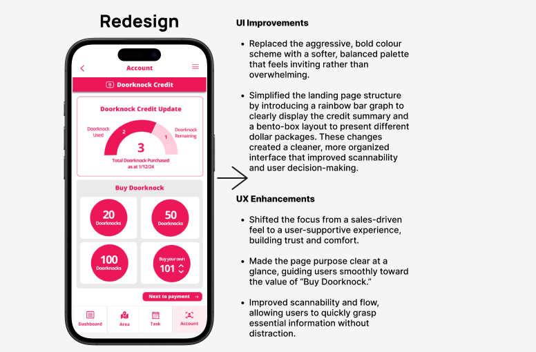
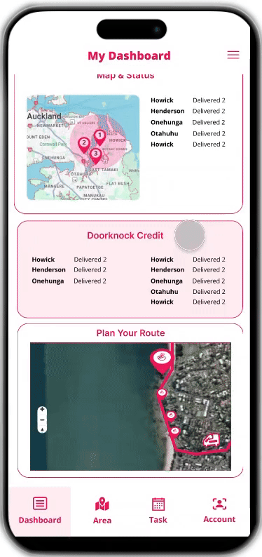
Design a single view that displays the current DK credit balance, usage history, and remaining balance.
Design an intuitive interface that allows users to easily top up credits.
Design a clear navigation flow that provides immediate confirmation after credit top-up.
To guide the design process, I developed a user story that outlines key requirements from the user’s perspective, which is critical in Agile for aligning features with real user needs.
As an agent who wants to top up and buy Doorknock property leads,
I want to easily view my credit balance, understand my usage history, and top up credits when needed,
so that I can confidently manage my credits and consistently engage with property leads.
2 . Ideation to Brainstorm Solution
Using Affinity Mapping to Improve the Credit Summary Interface
Using affinity mapping, I organized user feedback into key themes such as unclear balance, confusing top-ups, and lack of usage visibility. This process helped identify the most pressing pain points and guided the ideation of targeted solutions to improve confidence and usability in the credit summary UI.
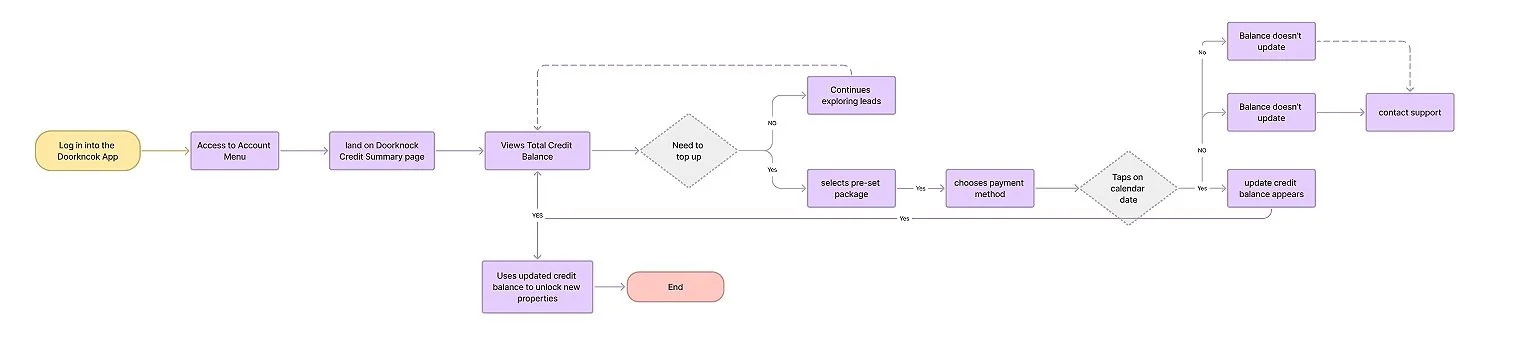
Structuring User Journeys with Flow Mapping Insights
Creating a user flow helped map out how agents interact with the credit system—viewing balances, checking usage, and topping up. This made it easier to spot friction points and guided ideation by highlighting where the experience could be simplified. T
3 . From sketching to lo -fi prototype
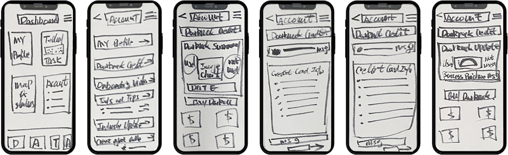
Sketching allowed me to quickly explore and visualize ideas for the credit interface, making it easier to identify the most intuitive layout before moving into detailed design.
I began by creating wireframes for the credit interface to simplify how agents check balances, review usage, and top up. These early designs laid the foundation for a clear and efficient user experience.

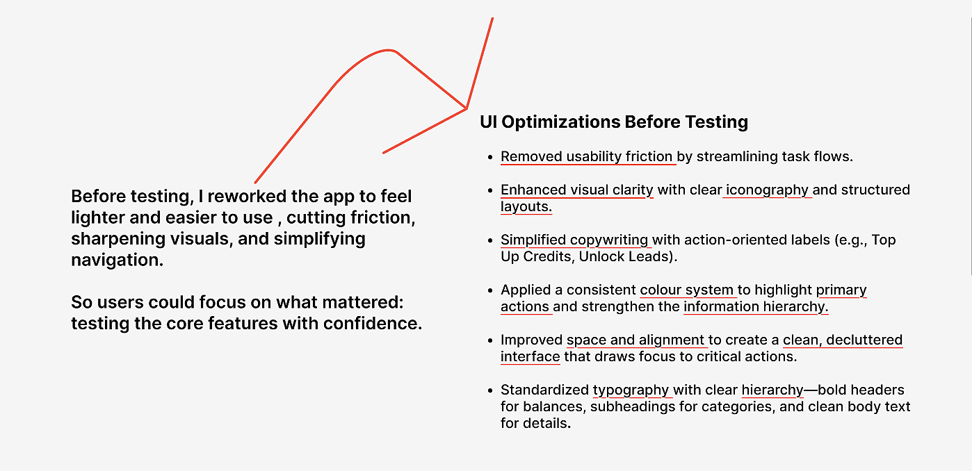
After the redesign, I ran remote usability testing to evaluate clarity and effectiveness.
The feedback directly informed updates that improved user satisfaction, resolved usability issues, and boosted overall engagement.
4 . User testing
The prototype shown here represents the MVP version tested with users.Usability Testing Plan:
🔍 What to Test
Clarity of DK Credit Summary UI
Can users easily locate and understand their current credit balance?
Is the usage history (used vs. remaining credits) clear and accessible?
Top-Up Interaction
Can users intuitively find and complete the top-up process?
Is the confirmation/feedback after purchase clear?
Confidence in Credit Management
Do users feel in control and informed throughout the experience?
🎯 Objective
To evaluate whether the redesigned DK credit summary interface improves users’ ability to understand and manage their credit status, complete a top-up with ease, and feel confident engaging with leads—ultimately supporting more consistent app usage.
The key finding from the user testing are below:
✅ Credit Balance Visibility: Most users easily understand their current DK credit balance at a glance.
📉 Usage History Clarity: Users found the used vs. remaining credit breakdown clear.
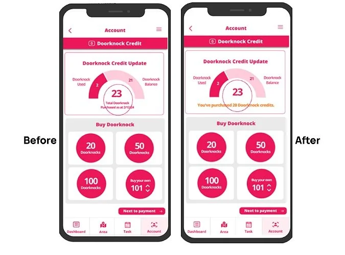
💳 Top-Up Interaction: Users found the top-up process intuitive, though a few wanted a clearer visual confirmation once the transaction was completed.
🔄 Feedback & Confirmation: Some users expected stronger feedback (e.g., animation or message) after topping up, to reassure them that the credit was successfully added.
What I have learned:
Usability testing of the Doorknock credit flow delivered excellent results. Users completed the process in just 20–30 seconds, with clear satisfaction around ease of use and flow clarity.
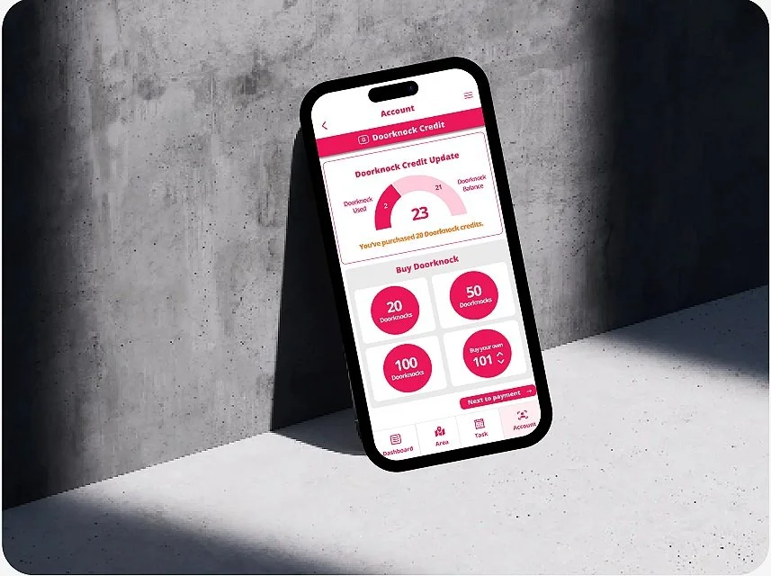
The high-fidelity prototype played a key role in validating the design, proving it to be both intuitive and efficient.
Only minor refinements were needed, confirming the solution is user-ready and aligned with business goals.
Recommendations
More clarity in data visualisation on how Doorknock credits are used and reflect the remaining balance.
A clear confirmation message on "successful credit purchase".